Choosing paint colors for your home is about more than simply picking shades that look nice on a swatch. Behind every hue is a measurable interaction between light, human perception, and emotional response. When you understand the science of color and how tones influence mood and space, you can curate rooms that feel intentional, harmonious, and deeply personal.
Whether you’re refreshing a single room or preparing a whole home for market, the right palette can transform the atmosphere and even increase perceived value. Here’s how to choose thoughtful tones for every room using color psychology, lighting principles, and design best practices.
Understanding Color Psychology
Color psychology explores how hues influence emotions and energy levels. While individual reactions may vary, research consistently shows that certain tones tend to evoke predictable responses.
Warm colors like reds, oranges, and yellows feel energizing, social, and stimulating. They’re great for lively spaces, but choosing muted or toned-down versions helps avoid overwhelming the senses.
Cool colors such as greens, blues, and purples create calming, restful environments. These are ideal for bedrooms, bathrooms, and any room where relaxation is the priority.
Neutrals remain timeless because they provide balance and flexibility. Shades of beige, gray, white, and greige can be easily paired with accent colors and work well in modern, transitional, and classic homes.
Understanding the emotional tone you want each room to convey is the foundation of choosing the right paint.
The Role of Lighting in Color Selection
Light has a dramatic impact on how a shade actually appears on your walls. Colors shift depending on the light source, angle, and time of day.
Natural light from north-facing windows casts cooler, soft shadows that work well with warm tones. South-facing light is bright and warm, enhancing both neutrals and saturated hues.
Artificial lighting also affects perception. Incandescent bulbs warm up colors, while LED and fluorescent lights can make them appear cooler. Always test paint samples at different times of day to see their true behavior.
Artificial lighting also affects perception. Incandescent bulbs warm up colors, while LED and fluorescent lights can make them appear cooler. Always test paint samples at different times of day to see their true behavior.
Rooms with limited natural light often benefit from lighter tones that reflect brightness, while rooms with abundant sunlight can handle deeper, more saturated shades.
Undertones: The Hidden Influencers
Even neutral colors often contain subtle undertones such as pink, yellow, green, blue, or violet. Understanding undertones ensures the color complements other elements in the room, such as flooring, countertops, fabrics, and furniture.
For example:
- A gray with blue undertones pairs beautifully with cool stone or marble
- A beige with yellow undertones enhances warm woods
- A white with subtle green undertones can feel fresh and crisp in sunlit rooms
Comparing paint swatches side-by-side helps reveal undertones you might not initially notice.
Choosing Colors Room by Room
Each room has its own purpose, energy, and lighting conditions. Use these guidelines to choose tones that support the function of the space.
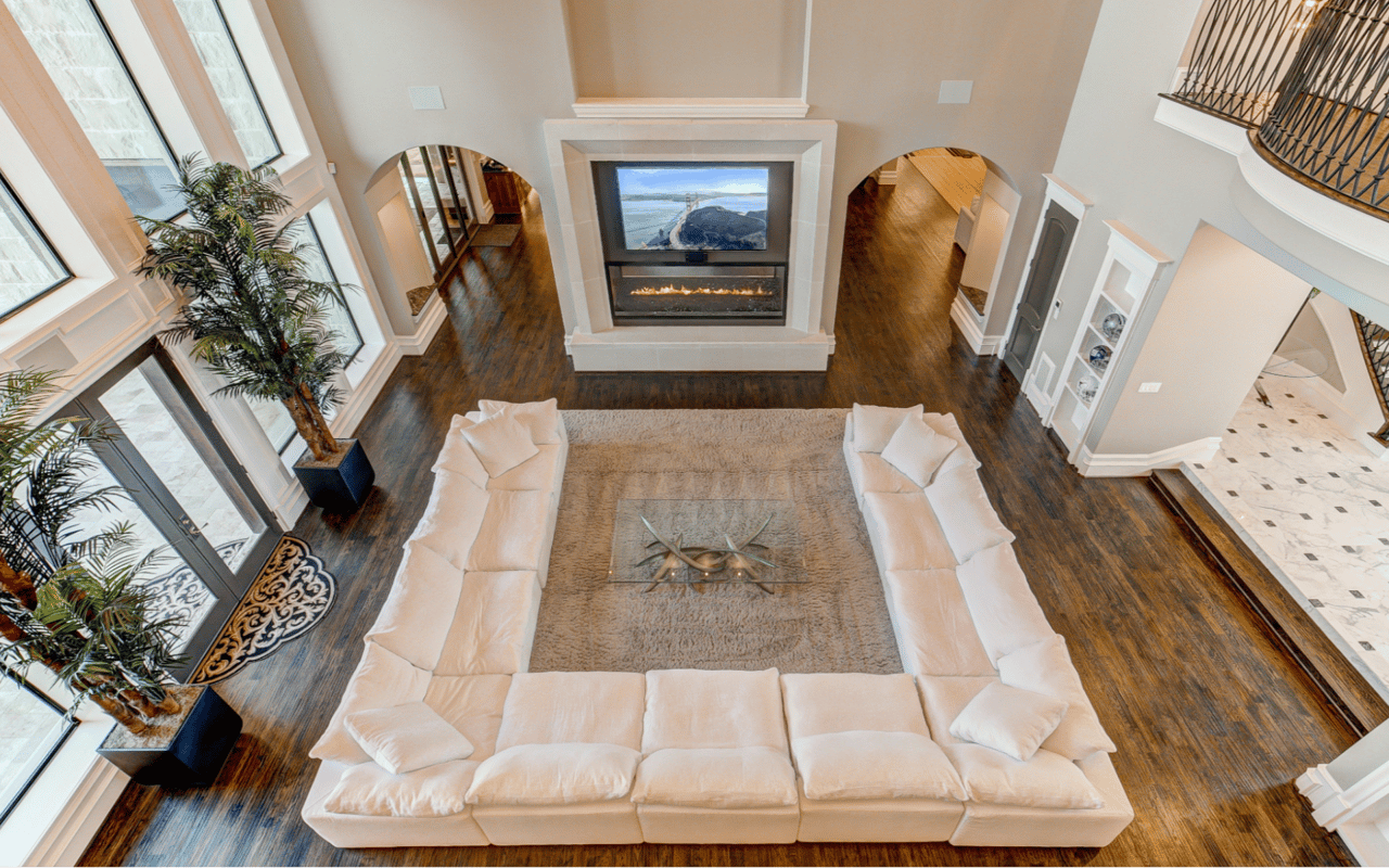
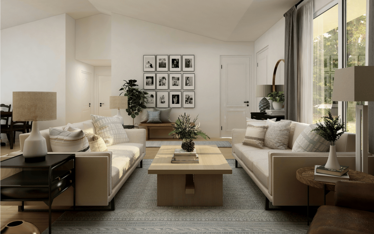
Living Room
This is typically the most social and multifunctional space in a home. Neutrals like soft grays, warm whites, or greige create a flexible foundation for evolving décor. If you enjoy color, muted greens or earthy terracottas bring warmth and sophistication without overpowering the room.
Kitchen
Color can stimulate appetite and conversation. Soft yellows and warm whites brighten the space, while navy or forest green cabinets paired with light walls add striking contrast. Crisp whites remain popular because they reflect light and keep the kitchen feeling clean and inviting.
Dining Room
Rich tones such as deep blues, emeralds, or charcoal grays elevate the dining experience by creating a cozy, intimate mood. If you prefer something lighter, consider muted sage or taupe to maintain elegance while keeping the palette airy.
Bedroom
Rest and restoration should guide all color decisions here. Cool colors like pale blues, soft lavenders, and muted greens are proven to lower stress levels and promote calmness. Choose matte finishes to enhance serenity and reduce glare.
Bathroom
Spa-like environments thrive on clean, soothing tones. Whites, light grays, seafoam greens, and powder blues help create a sense of luxury and freshness. For small bathrooms, lighter colors visually expand the space.
Home Office
The right color can improve focus and productivity. Greens boost concentration and are easy on the eyes, while soft blues encourage clarity. If you prefer a more energizing workspace, try muted ochre or dusty rose in small doses.
Kids’ Rooms
Color plays a big role in creativity and comfort. Soft pastels promote calmness, while brighter shades stimulate playfulness. Consider incorporating a neutral base with colorful accents so the space can grow with your child.
Creating Cohesion Throughout the Home
A well-designed home uses color to create flow from one room to the next. You don’t need every room to look the same, but palettes should feel harmonious.
To achieve a cohesive look:
- Choose a base neutral that appears in most rooms
- Select one or two accent colors and vary the shades in different spaces
- Keep undertones consistent across the home
- Use color transitions strategically in open-concept layouts
This approach ensures each room has its own personality while maintaining an overall sense of unity.
The Power of Test Samples
Even with careful selection, paint can surprise you on the wall. Always test your chosen colors by painting large swatches and observing them in daylight and at night. Move furniture or décor nearby to see how the tones interact with the rest of the space. It’s a small step that often prevents costly or frustrating repaints.
Using Color to Enhance Architecture
Paint can highlight a home’s architectural strengths or visually adjust proportions.
For example:
For example:
- Painting walls and trim the same color creates seamless, modern lines
- Using contrasting trim colors emphasizes molding and craftsmanship
- Dark ceilings can make large rooms feel cozier
- Lighter walls help small rooms feel more open
Thoughtful placement of color elevates both style and structure.
Setting the Tone for Buyers
If you’re preparing to sell, color selection becomes even more important. Neutral palettes appeal to the widest audience and allow potential buyers to visualize themselves in the space. Subtle, warm tones tend to photograph beautifully and make rooms feel inviting during showings.
Professional staging and consistent paint choices often increase perceived home value and reduce time on the market.
Bring Your Home’s Vision to Life
Whether you’re refreshing your current space or preparing to list your property, understanding the science of color empowers you to make choices that enhance both beauty and function. Paint is one of the most affordable and transformative tools in design, and with the right strategy, every room in your home can feel intentional and inspiring.
If you’re planning a move or want expert guidance in presenting your home at its very best, connect with The Ryan Tradition, trusted Missouri real estate professionals. Their experience, local insight, and client-first approach make them an invaluable partner in every step of your real estate journey. You may also check Frontenac homes today!